Toast n’ Topics
Toast n’ Topics is a podcast offering bite-sized episodes on current economic topics for students and everyday people. Sachin and Ben, hosts of the podcast, were interested in revamping their brand identity.
My Role
Digital Designer
Team
Solo Project
Skills
Graphic Design, Project Management
Project Scope
Logo Design, Collateral Mockups, Podcast Covers
Project Brief
Create a fresh, updated look that maintains the podcast's approachable and conversational vibe.
Objectives:
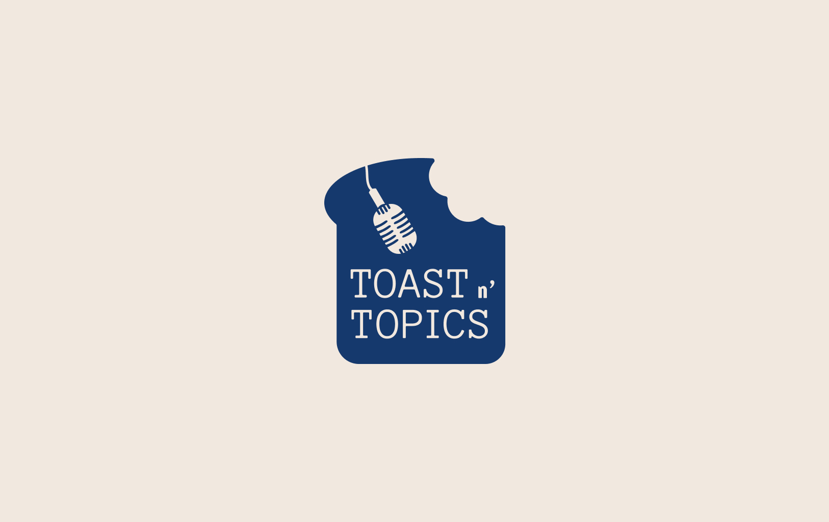
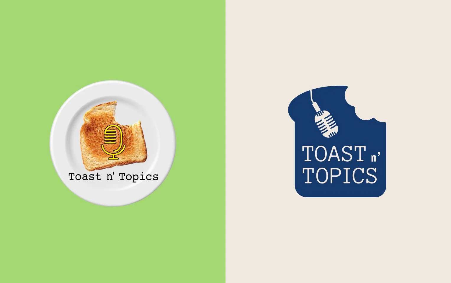
Keep elements of the old logo such as the toast, microphone, and monotype.
Incorporate colors such as blue and lavender - “calming, not too flashy, yet deep”.
A fun balance that thoughtfully combines elements from the old and the new.
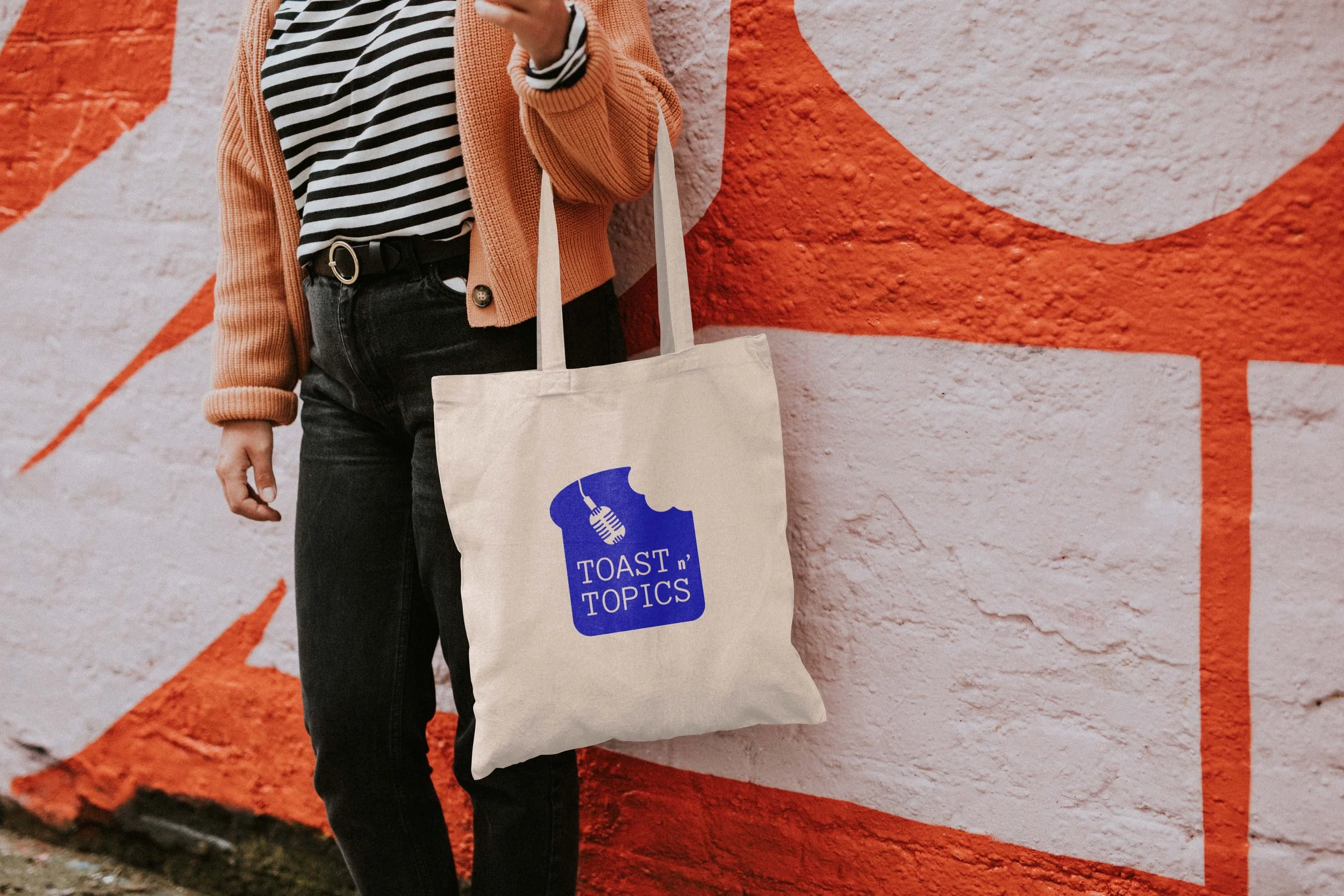
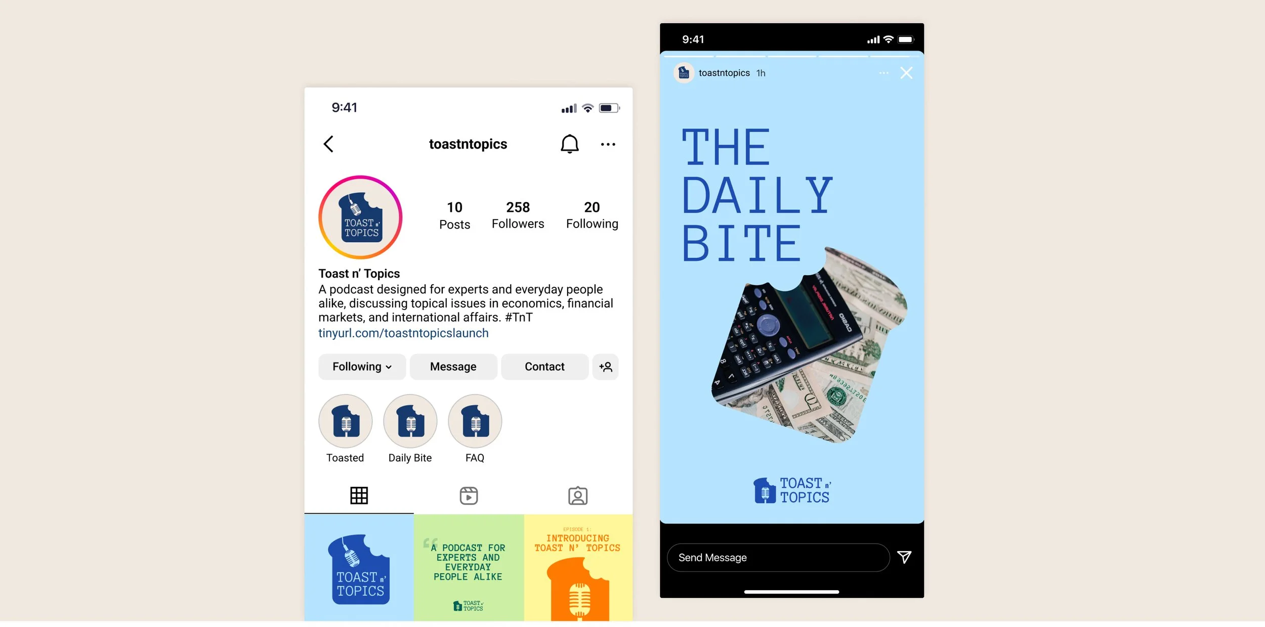
The new logo thoughtfully incorporates both the toast and microphone elements, along with the distinctive mono font. In addition to this, I came up with several creative color pairings and alternative logo marks for the team to utilize in their branding efforts. This variety allows for a flexible visual identity that can adapt to different applications and contexts.
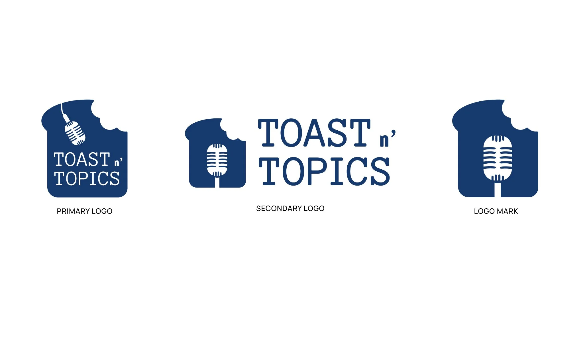
Primary, secondary, and logo mark design.
The primary logo serves as the main visual representation. The secondary horizontal logo can be utilized for collateral materials. The logo mark serves as a compact symbol, ideal for social media and icons, maintaining brand recognition even at a smaller scale.
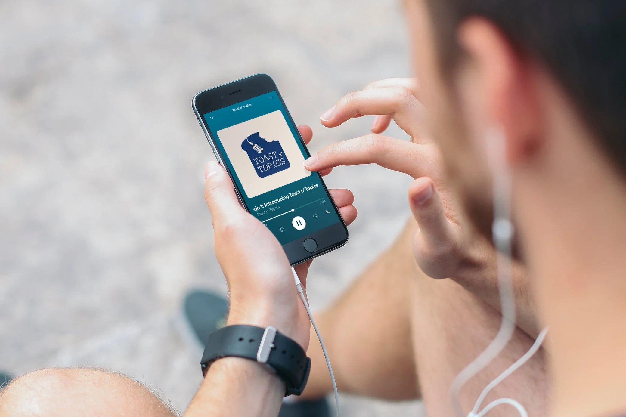
The Outcome
The final logo seamlessly merges elements of the original podcast identity with the envisioned new design direction. Additionally, I created mockups demonstrating potential applications for the updated logo.
Key Takeaways & Impact
Balancing the old and new: Retaining recognizable features helps maintain brand continuity while still allowing for creative innovation.
Iterative design process: Through rounds of feedback and revisions, the design was fine-tuned to meet both aesthetic and functional goals. The iterative process ensured alignment with the podcast.